Jack in the Box
GRAPHIC DESIGN + PRODUCTION
Packaging
Art Direction
Brand Aesthetic
Mailers + Coupons
Print + Digital Marketing
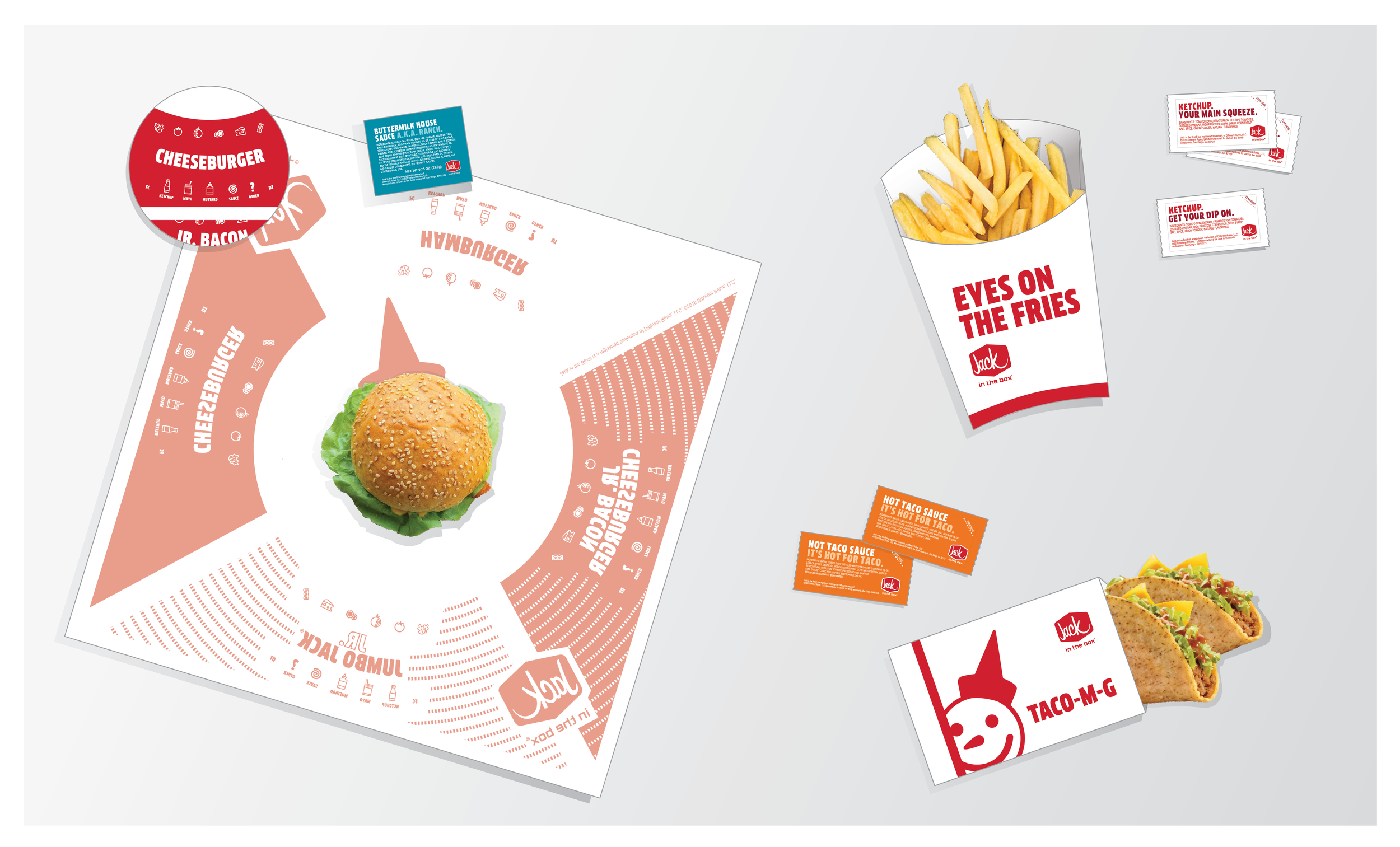
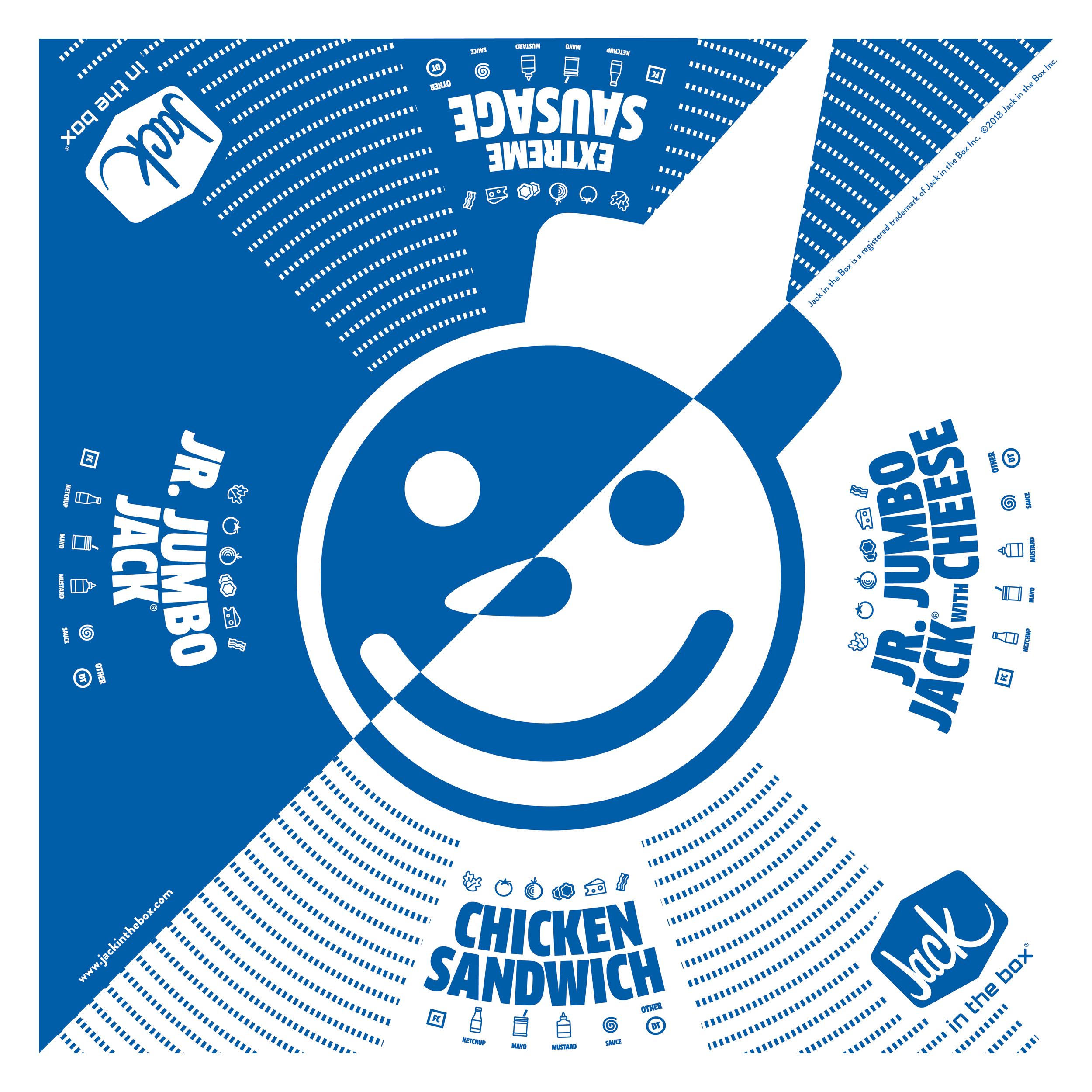
Packaging Redesign
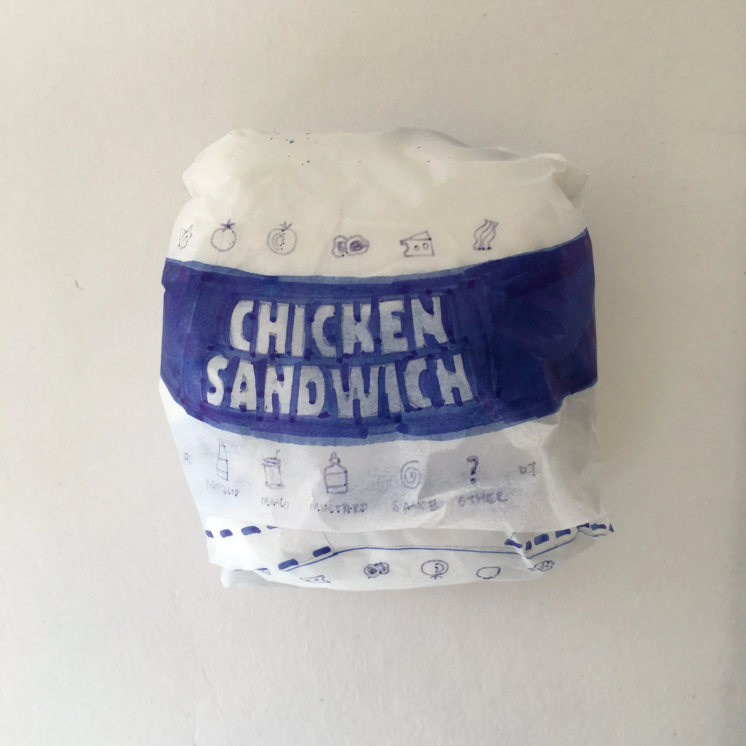
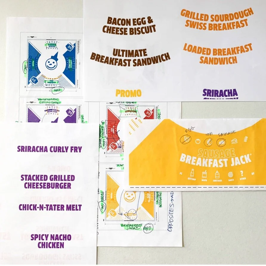
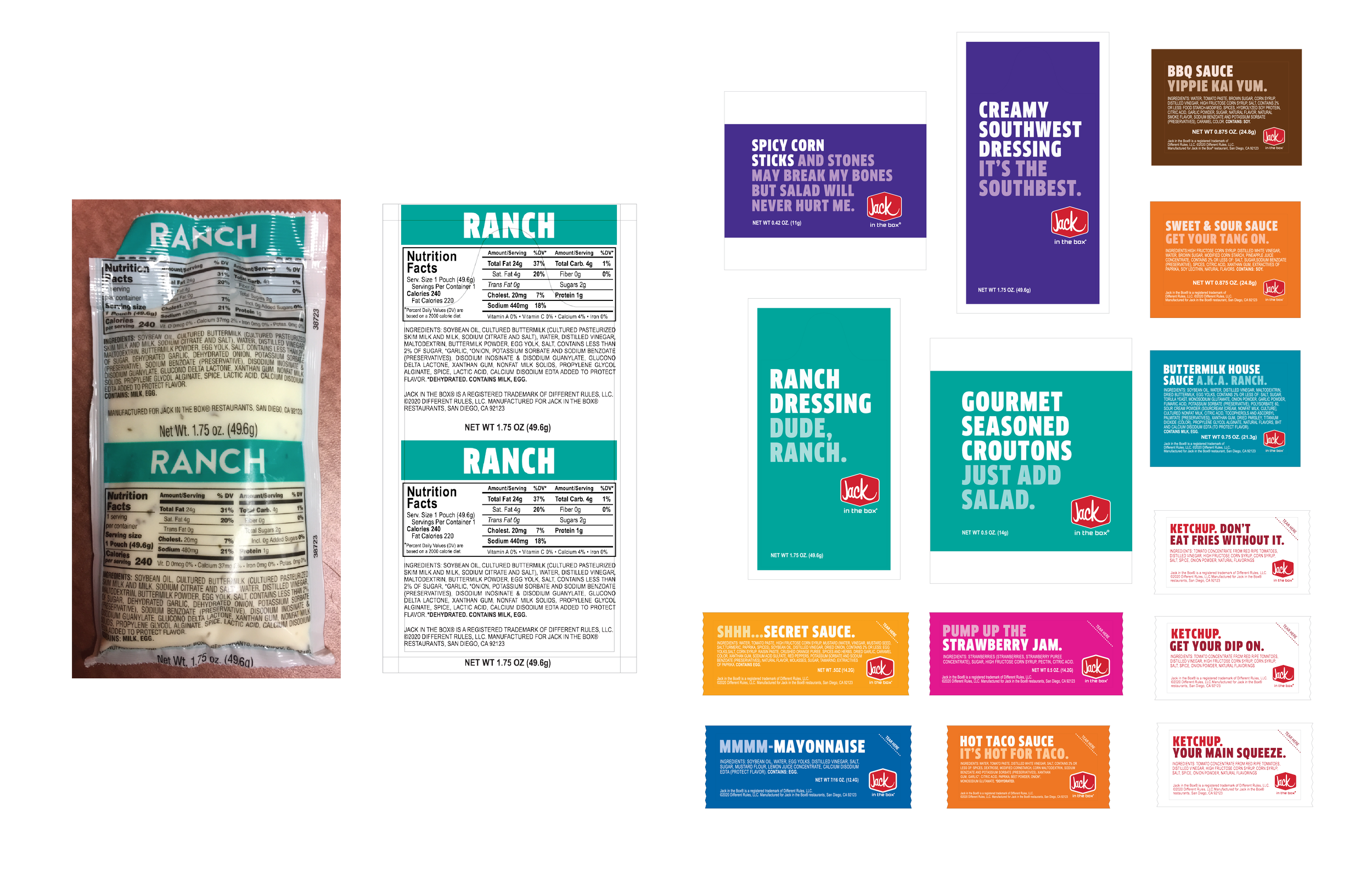
This was a full-suite packaging redesign that not only focused on complementing the brand’s new look and feel, but also improve operational issues related to order assembly. Ultimately, this new packaging strategy helped to streamline order accuracy and efficiency in Jack in the Box restaurants through a simple, yet effective, use of color, pattern, and iconography.
Even during the design and production process we came across challenges, such as procuring cost-effective samples that the R&D and Operations teams could test with. I was able to come up with a budget friendly solution using tracing paper, and eventually vellum copies from the printer, to allow the cross-functional teams to test using a substrate similar to the final packaging.
-

Old Design
-
Proposed Redesign
-

Cost Efficient Testing
-
Tracing Paper Trials
-
Ironing Out Details
-

The Result


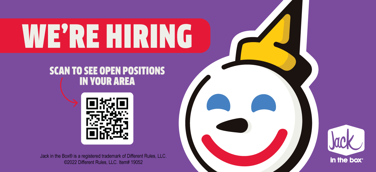
First Sighting


Primary Point of Purchase (POP)


My first foray in POP design – creating a custom lockup.


Regional + Internal Design
2021 - 2022
After the brand refresh there were a plethora of new assets to keep track of. I took the initiative to create an Adobe library that allowed fellow team members, and partnering agencies to access the correct colors, fonts, graphics, and more. This helped improve creative efficiency and consistency for the brand.